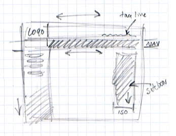
Planning How the Page Should BehaveBefore starting to create your page, it's a good idea to have a clear sense of how you want the various page elements to respond when the viewer changes the size of the browser window. Which elements can be flexible? Which need to be a constant size? A good way to plan this is to make a simple sketch of your layout, and note how you want different parts of the page to adjust to window size changes. This will help you see where you need to build flexibility into your design. Design goals for this page:
Move your mouse over the sketch to see how I plan to implement this design with flexible tables:
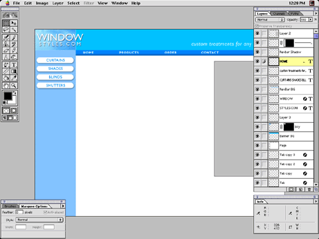
I may have to refine this scheme when I start to create the page, but I already have a good sense of its structure. Once you have the basic structure defined, you can use the sketch as a guide for which graphic elements you need to make the structure work. Here is my working file for the site interface: I'm creating the site graphics in Photoshop, but Fireworks or another image editor would work as well. This file is 800 x 600 pixels, but that's just a convenient way to get a sense of how the page will look in an average-sized window. I will be using only small pieces of this graphic. Most of the design will be implemented with small graphic elements embedded in flexible tables. Since I have already planned the structure of the page I know exactly what graphic pieces I need, and what size they need to be. (Mouse over the layout graphic to see which parts of the working file I will be using.) Next, we're going to build the banner area of the page. |
::This page last modified 8/13/2013 at 04:37::
 |
Copyright
© 2001-2026 DreamweaverFAQ.com All Rights Reserved. All brands, trademarks, tutorials, extensions, code, and articles are the property of their respective owners. A production of Site Drive Inc. Legal Notice | Privacy Policy | Disclaimer & Notice
|
 |


